How Amazon Tests Add-to-Cart Conversions
Amazon is the biggest ecommerce site in the world and notorious for continuously testing and implementing new features to optimize conversions. In 2012 Amazon tested five versions of the “Add to cart” button on the product detail page. This article explains how Amazon tests their product detail pages. The analysis was done based on screenshots gathered with Stillio Automated Web Page Screenshots. Let’s look at the setup and insights.

Product detail page
The Amazon product detail page is the most famous ecommerce page in the world. It’s famous for it’s length and the rigoures A/B testing Amzon does to improve conversions. This is how the product detail page looked in de fall of 2012.
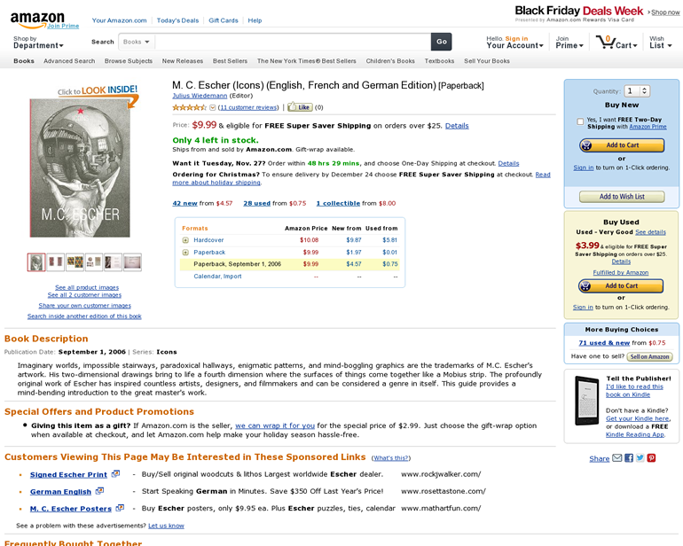
Amazon’s product detail page in the fall of 2012. Notice the “Buy new” and “Buy used” options on the right-hand side of the page.
[Off topic] Notice we used a product detail page with a book of M.C. Escher. A famous Dutch graphic designer. We highly recommend you take a look at his work.
Five different versions
This year Amazon tested five different versions of the “Add to cart” option on the product detail page. These are the versions they tested:
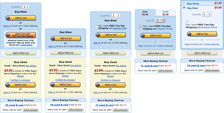
- Version 1: The original functionality that was used early in 2012. Hasn’t been used since august 2012
- Version 2: Only used very shortly in april 2012. This version does not contain the quantity option
- Version 3: The version that is mainly used at the end of 2012.
- Version 4: A test version that uses tabs to display “Buy used” information
- Version 5: A test version that uses an accordion like feature to display “Buy used” information
Less buttons and Amazon Prime prominence
Let’s take a look at the two main versions that Amazon used in 2012.
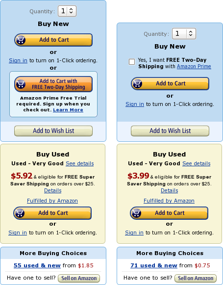
The two main “Buy”-boxes on the product detail page in 2012. Early 2012 [left] and fall 2012 [right]
They look very similar. The key difference is the “Amazon Prime Free Two-Day Shipping option”. In the early version this option was very prominent with a large orange button. Later Amazon reduced this option to a checkbox. There are probably two reasons for implementing the new design:
The new design features only one call-to-action in de “Buy new” box. This probably reduces confusion and improves conversion rates. The new design focuses less on Amazon’s “Prime” service. Early 2012 Amazon promoted their “Prime” service prominently in the “Buy new” box. In the fall this prominent mention was removed and a new position was created in the main navigation.

Two versions of the main navigation. September 2012 [left] and early 2012 [right]
Less “Buy used” prominence
In October of 2012 Amazon started testing two rather revolutionary designs of the “Buy”-boxes. In these designs the prominent “Buy used” option was removed and replaced by a less prominent tab featuring the price.
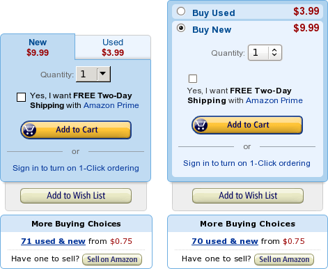
Test versions for the “Buy”-boxes on the product detail page. Tabs [left] and accordion like [right]
The reason for this test was probably the hypothesis that the “Buy used” option distracts visitors too much from the main “Buy new” option. Removing the prominent “Buy used” box might improve conversions for new products.
Other minor differences include the “Add to wishlist” option and the “Sign in” links. The “Add to wishlist” feature was separated from the “Buy new” box so it would be even more clear that there is only one primary call-to-action. The “Sign in” links are changed also to a non underlined version were the whole sentence is clackable.
These test versions were last seen in November. Probably Amazon doesn’t want to test these options during the holiday season.
Conclusion
After all these years Amazon is still testing the most important feature on their website: the “Add to cart” button. It looks like Amazon is looking at reducing the number of primary call-to-actions above the fold to one. probably to increase the conversion rate of the “Buy new” add-to-cart option. It will be interesting to see if one of the test versions will replace the current version in 2013.